
Best LogoMARKETINGUncategorized
Agency
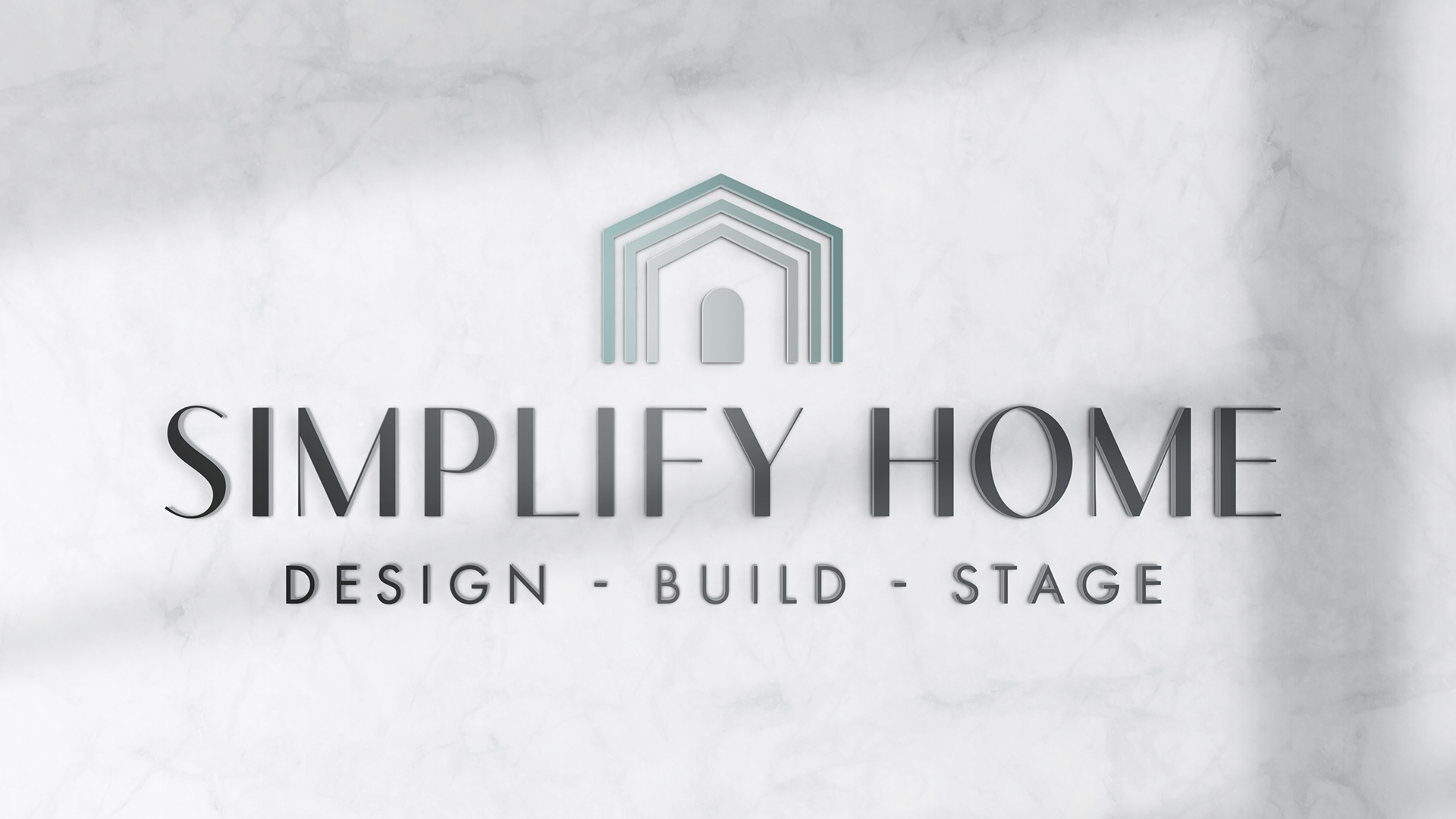
Our Simplify Home client came to us seeking a more professional brandmark to reflect their brand values: clarity, convenience, craftsmanship and confidence. A logo which would also represent their unified multi-faceted business—offering an all-in-one approach to interior design, construction and staging—all to appeal to discerning Southwest Florida homeowners.
The new brand identity design they chose centers around a stylized home icon—an abstract, geometric structure which visually communicates with simplicity, order and trust. This emblem dully represents their suite of services to make a unifying home, and all-the-while reflects the firm’s core values. Designed to convey structure without rigidity, the mark reflects Simplify Home’s mission to bring ease and organization to what can otherwise be a complex process.
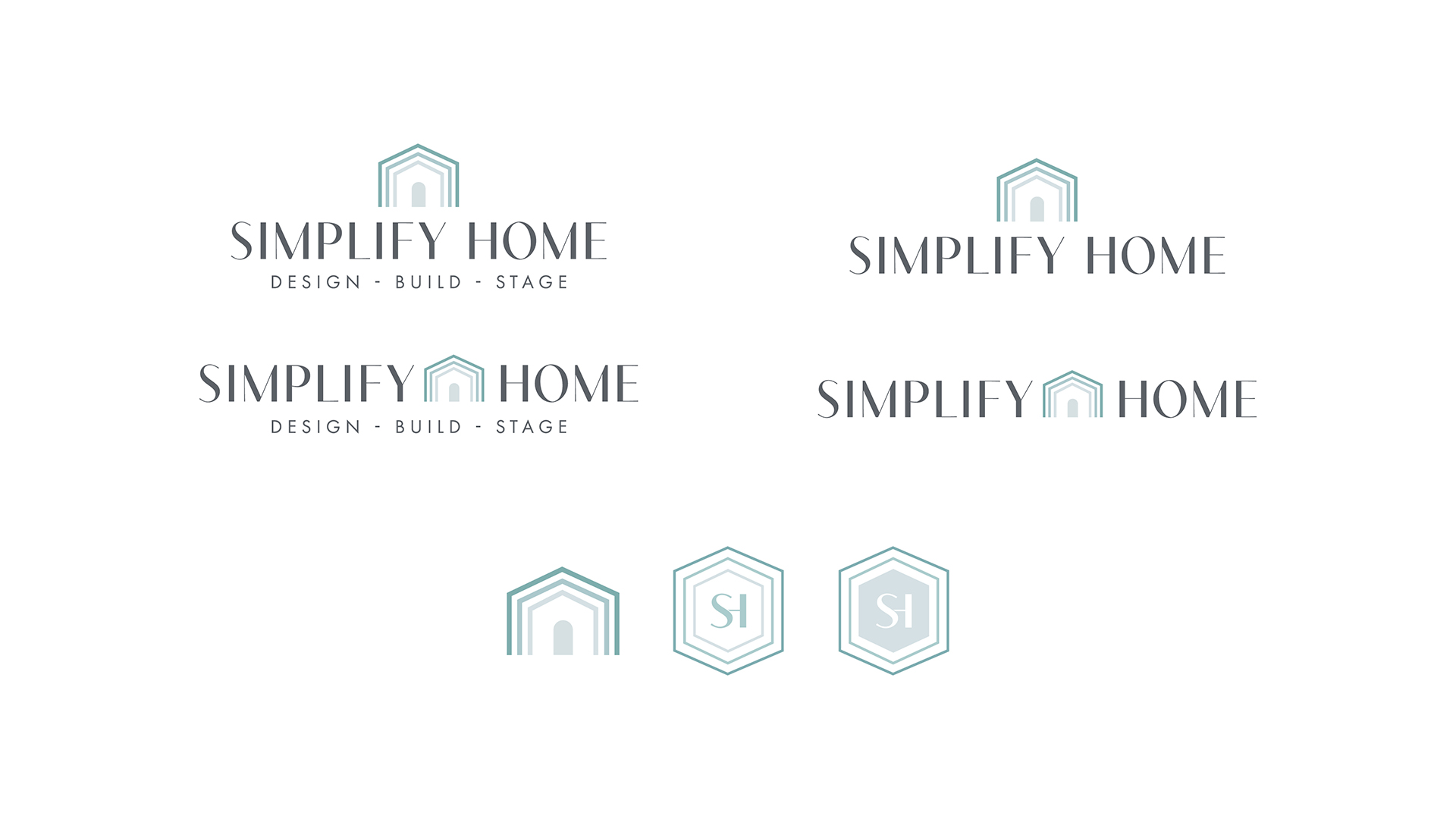
Color selection was key in defining the brand’s tone. A series of soft yet sophisticated blues and teals were chosen to evoke calm, capability and modernity, balanced by a deep charcoal for structure and strength. The visual system was built to support multiple logo configurations—horizontal, stacked and monogram—ensuring seamless usage across everything from truck wraps to business cards, digital banners and social media.
Care was taken to design a mark to live across environments and mediums without losing its clarity or professionalism. The hexagonal monogram adds a versatile secondary brand element while preserving cohesion with the primary logo and reinforcing the company’s identity at a glance.
The Simplify Home logo encapsulates the brand’s value proposition with precision and clarity. It signals a new standard in home service branding—minimal yet memorable, refined yet accessible. It stands as a confident, scalable identity for a growing business with a clear and compelling purpose.