
Best LogoMARKETING
Associate
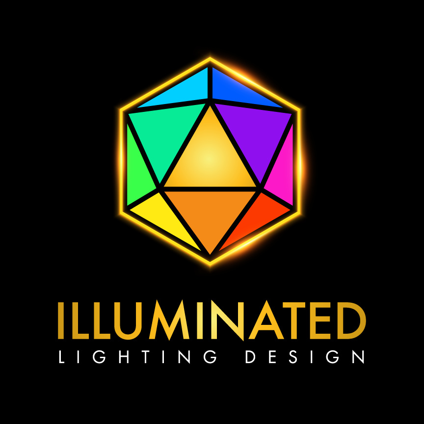
Our logo is more than a visually striking mark—it’s a thoughtfully crafted tribute to the iconic D20 die, one of the five Platonic solids and a universally recognized symbol in tabletop gaming. As an icosahedron made of 20 identical equilateral triangles, the D20 represents perfect symmetry, balance, and complexity—the same principles that define both immersive gameplay and our thoughtful lighting design practices.
But the D20 isn’t just symbolic of fairness and possibility. In our logo, each distinct color highlights the breadth and diversity of our deliverable packages, visually capturing the multifaceted nature of our services. From bold campaigns to nuanced strategies, every hue stands for a unique offering—together forming a cohesive whole that mirrors the unity of the icosahedron.
Designed with a vibrant, modern aesthetic, our logo also speaks directly to our savvy audience. It invites curiosity, evokes imagination, and signals innovation—all while honoring the rich heritage of symmetry and balance that inspires our work.
By combining timeless geometry with contemporary design and meaningful symbolism, this logo doesn’t just represent a brand—it resonates with a community.