Best LogoMARKETING
Associate
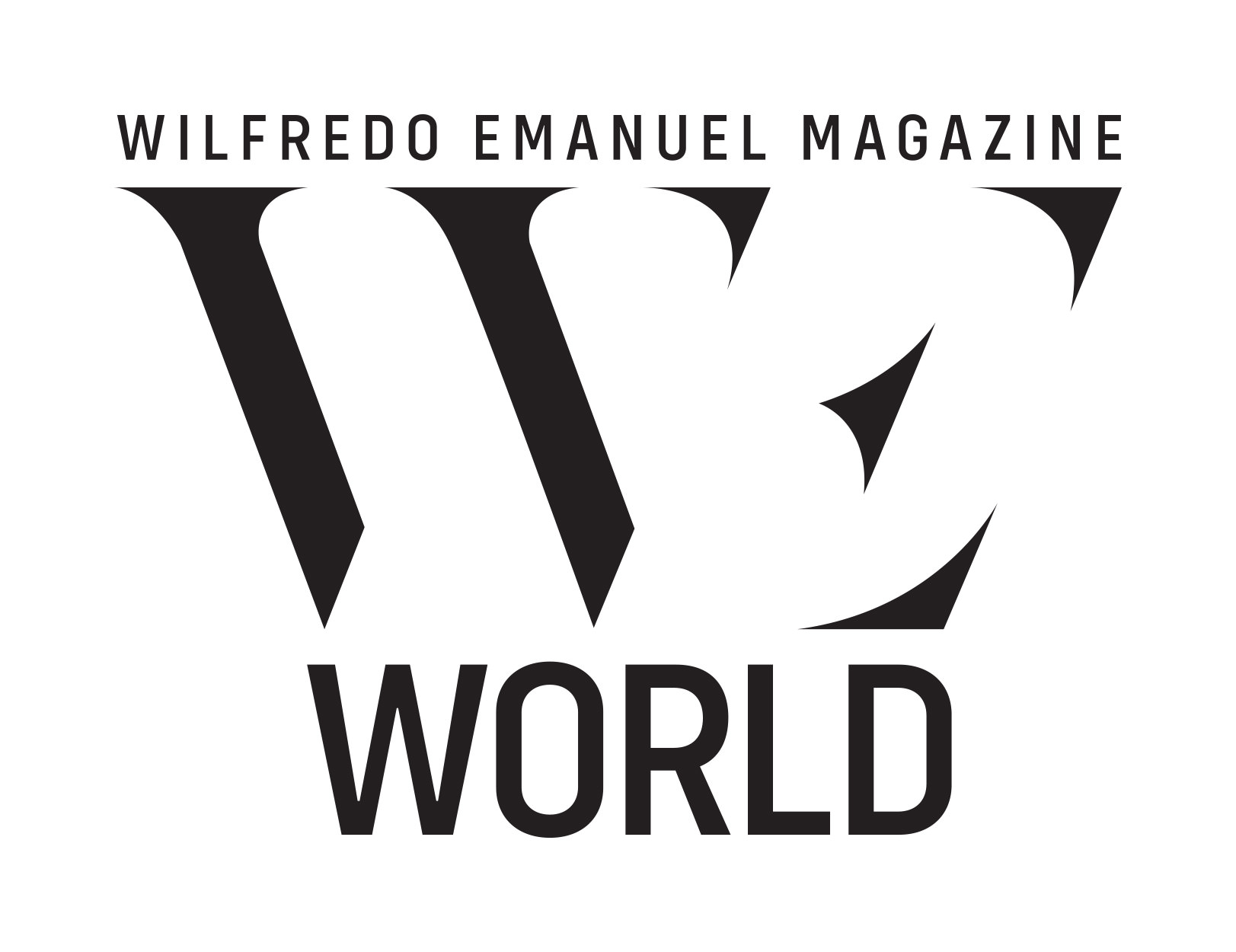
The WE World Magazine logo beautifully embodies the essence of its brand identity while also paying homage to its roots in Wilfredo Emanuel Designs. The logo design cleverly merges the distinctiveness of the Wilfredo Emanuel (WE) Designs logo with the inclusive concept of WE World, emphasizing our collective connection as inhabitants of a shared planet.
Drawing inspiration from the original WE Designs logo, the WE World Magazine logo maintains its visual integrity, yet adds a unique twist to reflect its global perspective. The prominent use of the initials “WE” in the logo serves as a direct link to Wilfredo Emanuel, establishing a strong connection to its design heritage. At the same time, the logo goes beyond the individual brand, incorporating the phrase “World” in a creative and harmonious manner. This addition reinforces the magazine’s overarching theme of interconnectedness and emphasizes the idea that we are all part of one global community. The elegant fusion of the initials and the phrase within the logo symbolizes the seamless integration of Wilfredo Emanuel’s design legacy into the wider world it represents.
With its thoughtful design and meaningful symbolism, the WE World Magazine logo is a powerful representation of the publication’s mission to celebrate diversity, foster unity, and inspire exploration. It stands as a visual reminder that we are all united under the same sky, exploring the vast wonders of our shared world.


